 |
|


 Jun 29, 2011, 04:24 PM // 16:24
|
#121 |
|
Krytan Explorer
Join Date: Sep 2008
|

loving her eyes :3
|

|

|
|
Jul 01, 2011, 05:27 AM // 05:27
|
#122 |
|
Desert Nomad
Join Date: Apr 2009
Guild: Trifecta Luminati [TRI]
Profession: W/
|
Oh Sailor Moon, that sure takes me back to the days of Cartoon Network when they had that huge hourly long block of anime shows.
Anyways, the pose looks great. Though the top portion of her head looks a little big considering the angle we're at. I think bringing in the back/top portion of her head would help. Also, I don't think we'd be seeing so much of the left hair bun - it would almost be hidden. At the moment, if you were to tilt her head into a straight on view, that bun would be sitting on the crown of her head. |
|
|
|
|
Jul 01, 2011, 06:29 PM // 18:29
|
#123 |
|
Furnace Stoker
Join Date: Jan 2009
Guild: [SOTA]
Profession: D/
|
We are seriously not going to go into the amount of Sailormoon stuff I own. It's almost silly. And yes, I will be rebuying all of the manga when they're rereleased this fall, as my copies are all really old and falling apart
 Thanks guys  Charlie - Hmmm, maybe I'll try adjusting it. I'm kind of going all over for this and taking advantage of the fact that the manga and anime versions of Serenity look slightly different, and some things I'm simplifying for the sake of looking more realistic (like the dress) while others I'm keeping closer to manga-style, like how even at angles like that, the far bun is still clearly visible ;P (cos in all honesty...hair will never look like that in reality. Trust me. When I had long hair in high school I could do my hair up like that )
|
|
|
|
|
Jul 04, 2011, 07:58 AM // 07:58
|
#124 | |
|
Desert Nomad
Join Date: Apr 2009
Guild: Trifecta Luminati [TRI]
Profession: W/
|
Quote:
|
|
|
|
|

|
Jul 04, 2011, 04:14 PM // 16:14
|
#125 |
|
Furnace Stoker
Join Date: Jan 2009
Guild: [SOTA]
Profession: D/
|
Pics or it didn't happen D:
|
|
|
|
|
Jul 04, 2011, 10:31 PM // 22:31
|
#126 |
|
Furnace Stoker
Join Date: Jan 2009
Guild: [SOTA]
Profession: D/
|
Finished! I discarded three or four different background attempts before I went "eff it" and did a soft textured colored background, similar to the backgrounds in a lot of the artbook images.
I also played around with the hair, going between blond (anime accurate) and silver (manga accurate), and decided that the silver matched better. Over all, I'm pretty pleased with it, and I think I did a good job combining realism with the manga artbook style and aesthetic. http://yanachan.deviantart.com/art/m...etsu-216657571 |
|
|
|
|
Jul 07, 2011, 01:38 AM // 01:38
|
#127 |
|
Forge Runner
Join Date: Feb 2011
Location: In a Kurzick retirement village, reminiscing about Magmas shields......
Guild: GW1 アoo アugs アlan [ァアァ] ~ GW2 Teh Academy [PhD]
Profession: D/Me
|
Looks awesome, I love how it how her "Aura" appears arround her in your background. You've got some really nice art in this thread, thanks for sharing.
|
|
|
|
|
Jul 08, 2011, 03:14 PM // 15:14
|
#128 |
|
Furnace Stoker
Join Date: Jan 2009
Guild: [SOTA]
Profession: D/
|
Thanks so much!
So yesterday I went out and played with my camera a bit - was taking macro photos of some of the plants in the yard. 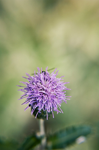 070711_01 by ladyverene, on Flickr  070711_02 by ladyverene, on Flickr (I absolutely love this one, as weird as it looks - it was completely on accident)  070711_03 by ladyverene, on Flickr |
|
|
|
|
Jul 08, 2011, 04:51 PM // 16:51
|
#129 |
|
Desert Nomad
Join Date: Mar 2007
Location: UK/Austria
Guild: [bone]
Profession: P/
|
ooh nice! the depth of field is very lovely. and I'm now stalking you on Flickr!
|
|
|
|
|
Jul 08, 2011, 05:00 PM // 17:00
|
#130 |
|
Furnace Stoker
Join Date: Jan 2009
Guild: [SOTA]
Profession: D/
|
Yay stalking!
I actually don't use my flickr much, unless I don't feel like uploading a ton of stuff to DA all at once. Thanks, btw ^^ I love macro photography but can't afford an actual macro lens. I bought a cheap set of macro filters on amazon a while back, though, and they actually work very well. |
|
|
|
|
Jul 08, 2011, 08:05 PM // 20:05
|
#131 |
|
Academy Page
Join Date: Jun 2009
Location: Finland, [Outi] HQ
Guild: Outin Omat [Outi]
Profession: Rt/
|
Macro filters? Anyway those pics are simply bokehlicious! Very good shots

|
|
|
|
|
Jul 08, 2011, 11:01 PM // 23:01
|
#132 |
|
Furnace Stoker
Join Date: Jan 2009
Guild: [SOTA]
Profession: D/
|
Like these (that's actually the exact set I got - the customer image that's by Stardust is mine). They just screw on to the end of the lens, and allow you to get in much closer than you can with a normal lens. I usually stack them all together.
Since a decent macro lens costs about $150+...yeah, I can't afford that. $11 set of filters works well enough for now. Last edited by Verene; Jul 08, 2011 at 11:04 PM // 23:04.. |
|
|
|
|
Jul 13, 2011, 11:53 PM // 23:53
|
#133 |
|
Furnace Stoker
Join Date: Jan 2009
Guild: [SOTA]
Profession: D/
|
Decided to mess about in Photoshop...didn't feel like actually drawing or painting, so I did a real quick manip. My interpretation of another book character I like
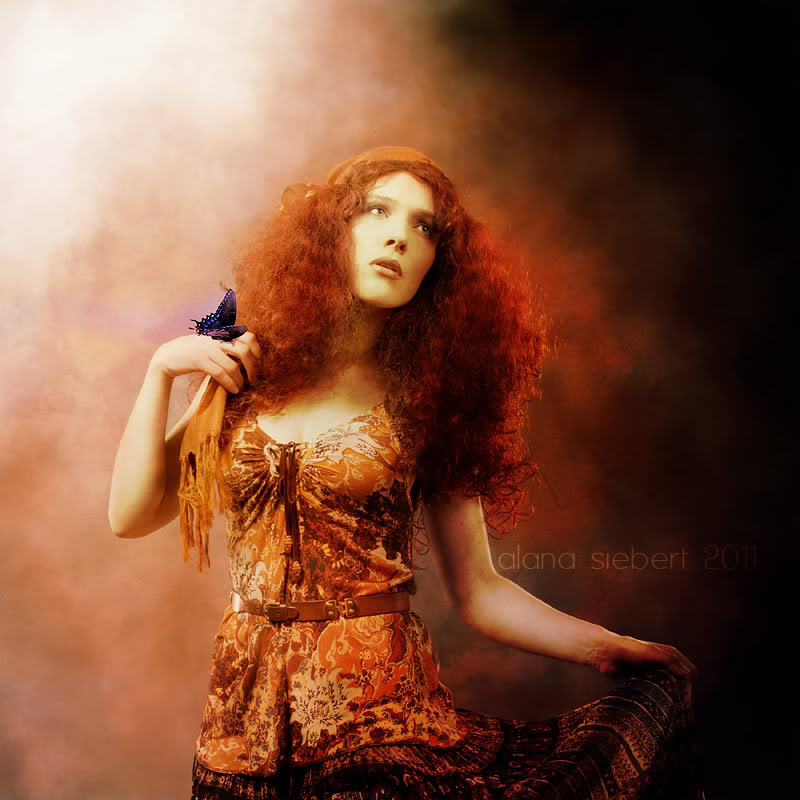 http://yanachan.deviantart.com/art/Lady-Fire-223437071 |
|
|
|
|
Jul 14, 2011, 12:37 AM // 00:37
|
#134 |
|
Desert Nomad
Join Date: Apr 2009
Guild: Trifecta Luminati [TRI]
Profession: W/
|
Very graceful, I like the color here. Has a vintage + gypsy kind of vibe to it.
|
|
|
|
|
Jul 30, 2011, 10:36 PM // 22:36
|
#135 |
|
Furnace Stoker
Join Date: Jan 2009
Guild: [SOTA]
Profession: D/
|
Thank ya ^^
Haven't done too much lately, but I was just recently hired to design/print the invitations for a friend's wedding. I'm currently on the "creating a billion mockups" stage of things while waiting to get the rest of the info from them. Here's a few so far: 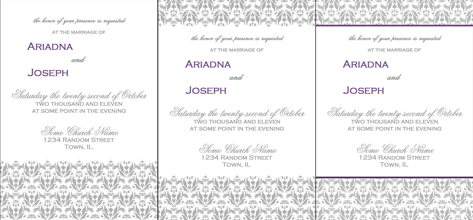 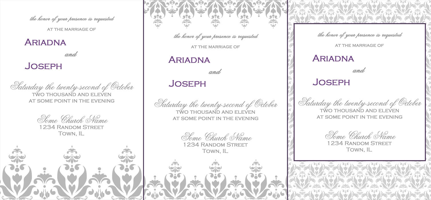 That's just all from one idea, I've a few others I'm going to play with as well. My favorite of these so far is the third one in the first image. |
|
|
|
|
Jul 31, 2011, 08:55 PM // 20:55
|
#136 |
|
Desert Nomad
Join Date: Mar 2007
Location: UK/Austria
Guild: [bone]
Profession: P/
|
they look nice, colours are lovely! what bugs me are the two names sitting on the left while everything else is centered. also, just as a suggestion: golden rule in graphics design says don't use more than three different types of writing on one page (that includes size differences as well as different fonts), I personally think there's maybe a tad much going on. If I was to pick, I'd go for the middle one bottom row
 I prefer the larger patterns, makes the page less crowded I prefer the larger patterns, makes the page less crowded
|
|
|
|
|
Aug 01, 2011, 12:08 AM // 00:08
|
#137 |
|
Site Contributor
Join Date: Aug 2010
|
Ooh fun! I'm totally waiting in anticipation for my lil sis and her bf to get engaged so I can make their wedding invitations XD She looks at me funny when I tell her that :O
|
|
|
|
|
Aug 01, 2011, 01:12 AM // 01:12
|
#138 | |
|
Furnace Stoker
Join Date: Jan 2009
Guild: [SOTA]
Profession: D/
|
Haha XD I'm sure that once it comes to printing 120 of these along with the RSVP and reception cards and then cutting them all down I'll be enjoying the process less :P
Quote:
They're actually centered.The cursive font is a must (they REALLY wanted a script/cursive font) but obviously doing it all in that would get difficult to read, but I'm pretty sure I kept everything as close in size as possible across the two fonts other than the names. I'll bump up the size on the top bit of text to match more closely, though. The other style idea they had they wanted a monogram on it, so I'm working on designing a few ideas for that now. |
|
|
|
|
|
Aug 02, 2011, 07:00 AM // 07:00
|
#139 |
|
Wilds Pathfinder
Join Date: Mar 2007
Location: Finland
Profession: R/
|
Wow your friends are lucky to get some help from you for their wedding. I was wondering about the centering of the text too but I see now why it's like that. For invitation cards etc. (I'm no typographer/designer) I would always google some references of traditional ones just to be sure if there is a pattern in how to make them. They all look rather nice, I couldn't be able to pick one haha. Good luck with all the work! But seriously you are saving your friends a dozen by doing this for sure. Those things are often super expensive... xD
|
|
|
|
|
Aug 02, 2011, 04:06 PM // 16:06
|
#140 |
|
Furnace Stoker
Join Date: Jan 2009
Guild: [SOTA]
Profession: D/
|
Thanks! They called me up last week going "can you please please pleeaaase help us and do this"; they'd been shopping for invitations and pretty much everything they found would have worked out to over $1000 for what they needed, and they weren't even going for anything too fancy! It seems that the moment you tack the word "wedding" onto anything, the price triples, it's ridiculous. So I'm being paid for this, but they're getting a really good deal, and I'm getting a nice amount of money as well as some lovely portfolio pieces.
I am using actual invitations online as references for the wording and stuff as well as the general look; they emailed me a few they had seen and like. I'm not trying to copy them exactly (because hello copyright issues), but I am keeping to the same styles they liked. |
|
|
|
 |
|

«
Previous Thread
|
Next Thread
»
| Thread Tools | |
| Display Modes | |


 Linear Mode

|
|

All times are GMT. The time now is 03:01 AM // 03:01.
